Among the myriad of color schemes utilized by filmmakers, the teal and orange look has emerged as one of the most iconic and visually striking. This color grading technique, which emphasizes these two complementary colors, not only enhances the visual appeal of films but also deeply influences viewer engagement by highlighting contrasts and enriching visual storytelling.
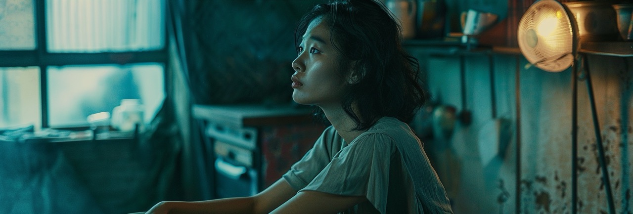
At its core, the teal and orange color scheme leverages the color theory principle that complementary colors (those opposite each other on the color wheel) can enhance visual contrast and create a pleasing aesthetic. Teal (a shade of cyan) and orange sit directly across from each other on the color wheel, making them perfect candidates for this approach. This technique not only accentuates the film's visual appeal but also subtly draws attention to the human subjects. Human skin tones fall into the orange spectrum, and by setting them against a teal backdrop, filmmakers can naturally make actors stand out, ensuring they capture the audience's attention.
The teal and orange look has been adopted across a wide range of films, from blockbuster hits to indie darlings. It became significantly prominent in the early 2000s, with movies like "Transformers" and "Mad Max: Fury Road" showcasing this aesthetic to create their mesmerizing and unforgettable visual landscapes. These films demonstrate how effectively the teal and orange look can be used to create dynamic visuals that accentuate the action and drama unfolding on screen.
Achieving the teal and orange look involves a series of steps during the post-production phase, specifically within the color grading process. The teal and orange look has become a hallmark of modern cinema, offering a visually striking contrast that can elevate the aesthetic appeal of any film project. Achieving this iconic look involves a nuanced approach to color grading, a post-production process that allows filmmakers to enhance or alter the color palette of their footage. This comprehensive guide delves deeper into the steps required to capture this distinctive style in your own projects, ensuring that even those new to color grading can grasp the essentials of creating visually compelling content.

Beyond color grading, the foundation for a successful teal and orange look often starts during the filming process, with a carefully planned lighting setup playing a pivotal role. The interplay between light and shadow not only defines the mood and atmosphere of a scene but also influences the effectiveness of the teal and orange grading in post-production. To harness the power of lighting, filmmakers should consider using complementary color temperatures.
By incorporating cooler, teal-toned lights for shadows and warmer, orange-toned lights for highlights, you can create a natural contrast that enhances the desired aesthetic right from the camera. This method involves positioning lights strategically to emphasize these color temperatures, such as using blue gels on lights to cast cool shadows in the background or warm, amber gels to illuminate subjects.
This pre-visualization of the final look allows for a more integrated and cohesive result, where the lighting and color grading work in harmony to produce a visually stunning effect. Moreover, understanding the time of day and the natural lighting conditions can also contribute significantly to achieving the teal and orange look. Shooting during the golden hour, for example, can naturally provide the warm tones, while choosing locations or times of day that offer cooler shadows can further support this visual style.
By thoughtfully combining these lighting techniques with the detailed post-production processes previously discussed, filmmakers can elevate the visual impact of their work, achieving a teal and orange look that is both striking and deeply integrated into the visual narrative of the film.

The first step towards mastering the teal and orange look is to become proficient with color grading software. Programs like Adobe Premiere Pro, DaVinci Resolve, and Final Cut Pro are industry standards, offering a wide range of features tailored for detailed color manipulation. Each software has its unique set of tools and workflows, but all are designed to give you extensive control over the color attributes of your footage. Familiarizing yourself with these tools will provide you with the foundation needed to begin experimenting with color grading techniques effectively.
Color correction is a preliminary yet critical step in the color grading process. This phase is all about achieving a balanced, neutral starting point for your footage. It involves adjusting exposure, white balance, and contrast to ensure that whites appear pure, blacks are deep without crushing detail, and mid-tones are correctly balanced. Skipping this step can result in a less cohesive color grade, as the subsequent color adjustments may amplify existing color imbalances in the footage. A well-executed color correction sets the stage for a more controlled and intentional application of the teal and orange aesthetic.
The core of achieving the teal and orange look lies in the creative manipulation of color wheels within your grading software. Color wheels allow you to adjust the hue, saturation, and luminance of shadows, mid-tones, and highlights separately. By pushing the shadows towards teal and the highlights towards orange, you create a visually striking contrast that is both appealing and emotionally resonant. However, it's crucial to maintain a balance; the goal is to enhance your footage without making it appear unnatural or overly processed.
A common challenge when applying a bold color grade is preserving natural skin tones. Viewer connection often hinges on the realism of characters' appearances, making it essential to keep skin tones looking authentic. Secondary color correction tools are invaluable here, as they allow you to isolate and protect skin tones from the broader color adjustments affecting the rest of your footage. This selective approach ensures that characters remain relatable and that the film maintains its visual integrity.
The impact of the teal and orange look is not solely dependent on hue adjustments; saturation and luminance play significant roles as well. Experimenting with the intensity and brightness of the teal and orange elements can alter the mood and atmosphere of your scenes. A more saturated teal can evoke a cooler, more detached feel, while a brighter orange can introduce warmth and vibrancy. Finding the right balance between these elements is key to achieving a look that complements the narrative and emotional tone of your project.

Plan Your Color Palette: Before filming, plan your scenes with the teal and orange look in mind. Consider how locations, costumes, and props can naturally introduce these colors into your footage.
Use Complementary Lighting: Employ lighting setups that emphasize teal and orange tones. Utilize cool lights or blue gels for creating deep, shadowy areas and warm lights or orange gels for highlights and illuminated parts.
Opt for Golden Hour Shooting: Take advantage of the golden hour—shortly after sunrise or before sunset—when the sun casts a warm, soft, orange glow, providing natural orange highlights.
Balance Natural Light and Shadow: Seek locations that offer a mix of shade and sunlight. This natural contrast can be accentuated in post-production to enhance the teal and orange effect.
Incorporate Reflective Surfaces: Use water, glass, or other reflective surfaces to naturally introduce or amplify the desired color tones in your scene.
Choose the Right Time of Day: Besides the golden hour, consider the blue hour (twilight) for naturally cooler tones in your shadows, complementing any warm light sources.
Selective Color Props and Costumes: Integrate teal and orange elements through the strategic selection of costume and prop colors, aligning with your visual narrative.
Adjust White Balance: Experiment with your camera's white balance settings to bias your footage towards cooler or warmer tones, aiding the post-production color grading process.
Use Natural Scenery: Leverage the natural colors of your filming locations. For example, the blue of the ocean or sky can serve as your teal background, while sandy beaches or autumn leaves can introduce natural orange elements.
Control Your Environment: If filming indoors, you have more control over lighting and color schemes. Use this to your advantage to create strong teal and orange contrasts with artificial lighting and set design.
Filter Your Lenses: Consider using lens filters to subtly shift the color temperature of your footage at the source, enhancing the desired color palette.
Monitor Color on Set: Use on-set monitors with color grading capabilities to get a preview of how your final footage might look, allowing for real-time adjustments to lighting and composition.
Educate Your Team: Ensure that everyone involved in the filming process understands the visual goal. This shared vision can lead to more cohesive decisions on set regarding lighting, costume, and set design.
Embrace Shadows: Don't shy away from shadows. Controlled shadow areas can be graded to beautiful teal tones in post-production, adding depth and contrast to your footage.
Post-Production Collaboration: While these steps focus on production, collaboration with your post-production team is crucial. Share your vision and any on-set decisions that were made to achieve the teal and orange look, ensuring a seamless transition into color grading.
By integrating these tips and steps into your filmmaking process, you can effectively capture the iconic teal and orange look right from the start, laying a solid foundation for post-production enhancement and achieving a visually compelling narrative.

For those looking to further refine their teal and orange look, advanced techniques such as LUTs (Look-Up Tables) and masking can offer additional layers of control. LUTs can be used to apply pre-defined color grades, serving as a starting point for further adjustments. Masking allows for even more precise control, enabling color adjustments to be applied to specific areas of the frame. These advanced methods can help achieve a more sophisticated and nuanced application of the teal and orange aesthetic.
By following these steps and embracing the iterative nature of color grading, filmmakers can master the art of the teal and orange look. This distinctive style, when executed with skill and subtlety, can significantly enhance the visual storytelling of your film, drawing viewers into the narrative through its compelling visual palette.
While the teal and orange look can add a dynamic layer to your visuals, subtlety is crucial. Overdoing it can lead to unnatural skin tones and a distracting overall appearance. Aim for a balanced approach by using this color scheme to enhance rather than dominate your film's visual narrative.
The teal and orange look in films is more than just a trendy aesthetic; it's a testament to the power of color grading in cinematic storytelling. By carefully applying this technique, filmmakers can create visually captivating scenes that enhance the emotional impact and depth of their stories. As you embark on your own color grading journey, remember that the key to success lies in balance, experimentation, and a deep understanding of the emotional nuances color can convey.
CINEMA LUTS PRO+
Turn your footage into cinematic masterpieces with our 1-Click solution LUTs. Over 30 handcrafted presets are waiting for you!
© cinema-luts.com
Imprint - Privacy Policy - Cookies - EAA - Blog